
Home / Blogs / Top 10 Power BI Visuals (2026’s Best) With Use Cases & Pro Tips
Top 10 Power BI Visuals (2026’s Best) With Use Cases & Pro Tips

(+1 Bonus chart at the end)
Do your dashboards look like a spreadsheet got lost on the way to a design class? Be honest. We’ve all been there.
Lucky for us, Power BI has some absolute visual gems hidden in plain sight. With the right visuals, your dashboards can go from “meh” to “wow, is this a Netflix UI for numbers?”
Whether you’re a financial analyst, project manager, or someone who just wants your data to stop looking like wallpaper paste, this list is your new best mate.
We’re breaking down the top 10 Power BI visuals (2026 edition), when to use them, and how to use them well.
From visuals for comparison to visuals for categorical data, this blog is your Power BI visuals cheat sheet and go-to guide.
1. Text Filter — “The Google of your dashboard”
Best for: fast keyword-based filtering.
Perfect for dashboards with long lists, the Text Filter visual lets users quickly search for a value instead of scrolling endlessly. Think of it as the Google search bar for your data.
Use cases:
- Customer or employee name search
- Product look-up by SKU or ID
Best practice: combine with bookmarks and navigation buttons for a seamless filtering experience.
2. Simple Waterfall — “The accountant’s dream”
Best for: showing positive/negative changes over time.
Waterfall charts are excellent for explaining financial data and changes in performance. The Simple Waterfall visual makes it easier to break down total values into components, with sleek formatting.
Use cases:
- Budget vs actuals
- Revenue breakdowns
- Expense categories
Why it’s great: especially useful for financial analysis, this visual also supports conditional formatting for quick impact. Read more in Simple Waterfall: all you need to know.
3. Word Cloud — “The artsy one”
Best for: visualising frequency of text data.
Survey responses? Social media buzz? Use a Word Cloud to display the most common words or phrases. It’s fun, colourful, and shockingly insightful.
Use cases:
- Visualising feedback or review themes
- Tracking trending words or complaints
Pro tip: clean your text beforehand and group similar keywords.
4. Chiclet Slicer — “The stylish selector”
Best for: stylish filtering with buttons.
It’s a slicer, but make it fancy. Chiclet Slicer turns filters into clickable tiles that can use icons, images, and text.
Use cases:
- Filtering product categories with logos
- Selecting regions or time periods visually
Power BI personalise visuals tip: users can rearrange or hide visuals for a truly interactive experience.
5. HTML Content — “The design geek’s weapon”
Best for: branding and formatted messaging.
This one’s a game changer if you want full control over your dashboard design. Use it to display styled text, buttons, banners or disclaimers with HTML and CSS.
Use cases:
- Adding branded headers/footers
- Displaying info like “Data last updated on…”
Best practice: use sparingly to avoid visual overload, but it’s great for UX.
6. Visio Visual — “The floorplan king”
Best for: diagrams, layouts, and flows.
Got a complex process to visualise? The Visio Visual lets you embed a Visio diagram and connect shapes to real-time Power BI data.
Use cases:
- Floor plans or space usage
- Process flows in manufacturing
- Org charts for HR
Pro tip: great for project management dashboards where spatial context matters.
7. Financial Reporting Matrix (by Profitbase) — “The boardroom favourite”
Best for: clean, professional financial reports.
This visual takes the basic matrix to the next level. Add hierarchies, format rows, and apply conditional formatting to build interactive profit and loss reports that are boardroom-ready.
Use cases:
- P&L statements
- Departmental spend
- Budget forecasts
Pro tip: a top pick in the Power BI visuals list for finance teams. Use row-level formatting and freeze headers for a better reading experience.
8. KPI Ticker (by MAQ Software) — “The flashy one”
Best for: displaying metrics in motion.
Create a news ticker-style display for your top KPIs. This visual keeps attention and adds a professional flair to digital signage or executive dashboards.
Use cases:
- Highlighting revenue, churn, or engagement stats
- Scrolling updates in office dashboards
Pro tip: use sparingly to highlight the most important figures. Don’t overload it with too many metrics or it’ll feel like Times Square.
9. Bullet Chart (by OKViz) — “The sniper”
Best for: comparing performance to targets.
The Bullet Chart is sleek and data-dense. Show actual vs target with background performance ranges. All the detail, none of the clutter.
Use cases:
- Sales goal tracking
- Comparing categories side-by-side
Best visuals for comparison? This one’s high on the list.
Pro tip: ideal for dashboards where space is limited. Keep your target lines distinct for better readability.
10. Small Multiples Line Chart — “The neat freak”
Best for: trend comparison across multiple categories.
Instead of a giant, messy line chart, split it into neat, repeating tiles — one for each category. Clean, tidy, and super insightful.
Use cases:
- Regional trend tracking
- Product-level performance
- Social media metrics
Pro tip: this is one of the Power BI best visuals for top 10 lists and comparisons.
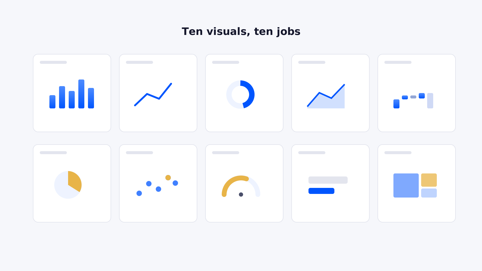
Bonus PBI visual that you cannot miss
Deneb — “The Batman of Power BI”
Best for: creating completely custom, pixel-perfect visuals.
This visual lets you create highly customised charts using Vega or Vega-Lite, giving experienced Power BI users far more control over how their data is presented. If you can’t find quite the right visual in Power BI or AppSource, Deneb is often where the fun begins.
Use cases:
- Bespoke data visualisations
- Advanced comparisons
- Executive dashboards where design matters
- Custom storytelling with data
Pro tip: Deneb is incredibly powerful, but it does come with a learning curve. Save this one for when you’re ready to go beyond drag-and-drop and get properly creative.
And there you have it…
10 Power BI visuals, plus a bonus pick for when you’re feeling adventurous. Whether you need a quick filter, a financial breakdown, a slick comparison or a completely custom creation, there’s a visual for the job.
The real trick isn’t knowing every visual in the Power BI visuals list. It’s knowing when to use what and, perhaps more importantly, when not to use one at all.
Wrapping up: your Power BI visuals guide
Choosing the right visual isn’t just about what looks good but more about clarity, context, and communication. This list isn’t exhaustive, but it’s a strong foundation to build dashboards that are interactive, useful, and loved by your users.
So, whether you’re searching for Power BI visuals ideas, Power BI visuals with conditional formatting, or wondering Power BI visuals when to use what, keep this guide bookmarked.
And remember: the best dashboards aren’t the ones with the most visuals. They’re the ones where every visual earns its place.
If you’re hungry for more Power BI tips, check out our other blogs!
Ready to trust your numbers again?
Book a free 30-minute call and we’ll talk through your current reporting and what’s possible.