
Power BI custom visual
Simple Waterfall
A waterfall chart that explains the movement, not just the change. Built for variance analysis where the answer needs to survive the next question.
Free · no licence key · published on Microsoft AppSource

Why we built it
The native waterfall stops one question short
Power BI ships with a waterfall chart, and for a simple before-and-after comparison it does the job. The difficulty comes when someone asks why — because that is when a fixed breakdown, a truncated label or a hard-coded orientation starts costing you the room.
Shows the change
- Breakdown fixed at design time — a new question means a report edit
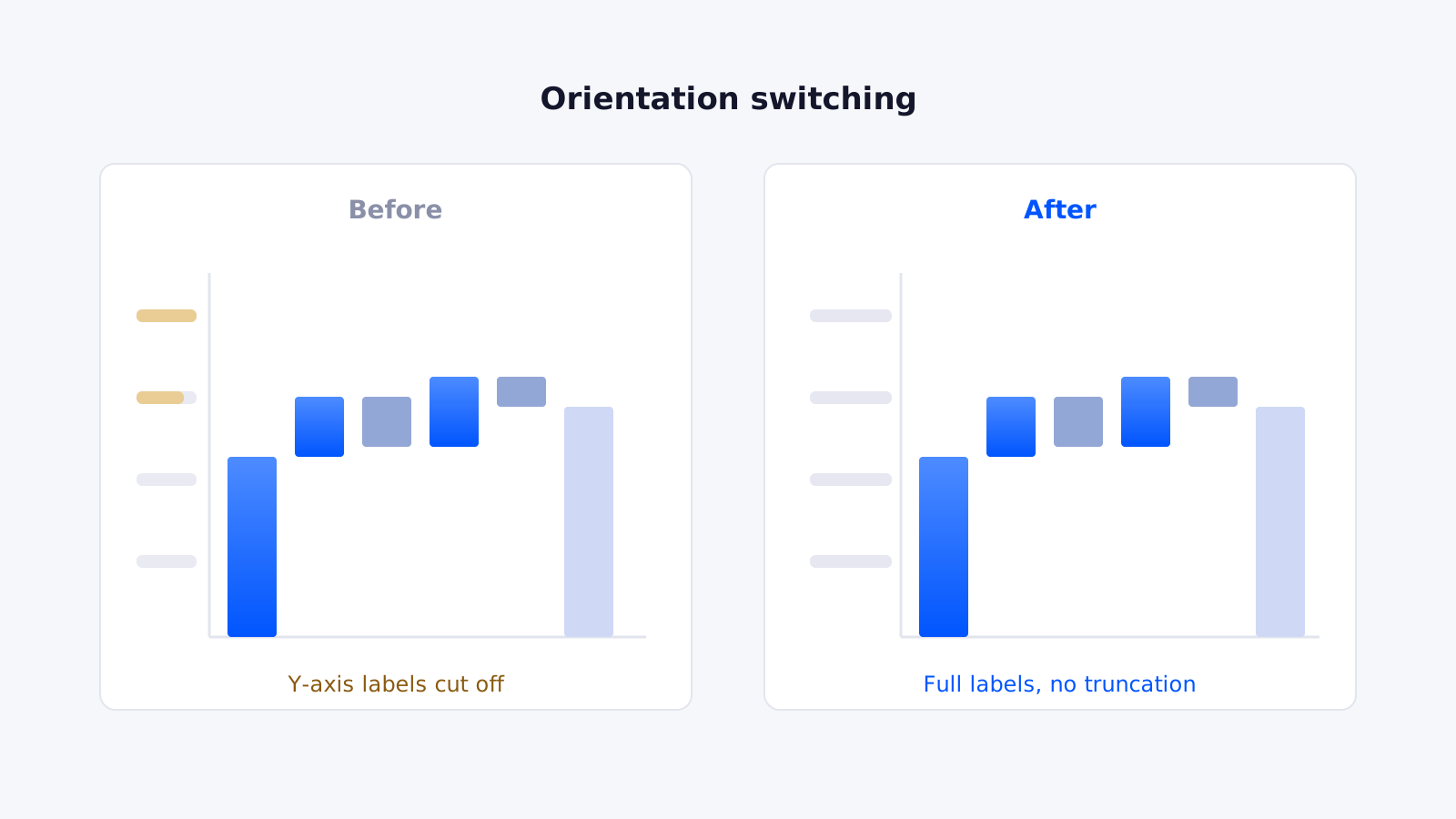
- Axis labels truncate when the orientation changes
- Limited control over number formatting and colour
- Layout fights long category names
Explains it
- Reader switches the breakdown themselves, in view mode
- Labels display in full, in either orientation
- Currency, percentages and decimals render as intended
- Fit-to-width and bar width both behave predictably
What it does
Built by a consultancy that uses it every week
Every feature here exists because a client engagement needed it. Nothing is in the visual to pad a feature list.
Dynamic grouping
Let the reader switch the breakdown between measures and categories on the fly, without anyone opening the report in edit mode.
Either orientation
Vertical or horizontal, with fit-to-width and manual bar width both working correctly in each. Long category names stop being a layout problem.
Labels that fit
Axis and data labels display in full, at every orientation. No silent truncation, no numbers cut off at the edge of the plot area.
Real number formatting
Currency, percentages, decimals and scientific notation all render as intended. Labels follow the measure format, or override it deliberately.
Deliberate colour
Separate control over increases, decreases, pillars and totals, so the chart can carry your palette rather than fight it.
Nothing leaves your tenant
The visual renders inside Power BI against data already in the report. No external calls, no storage, nothing to review with your security team.
Three ways to configure it
The same visual covers a fixed bridge, a driver breakdown and a reader-controlled analysis. Which one you choose depends on how much you want the audience to be able to explore.
Static measures
Measures only, no category field. Pillars and steps are defined manually — ideal for a fixed bridge such as revenue to net profit.
Static category
One category and one measure. The visual builds the walk from the category values, useful for driver breakdowns with a stable structure.
Dynamic grouping
The reader chooses the breakdown from the visual itself. One chart answers several questions without a report change.
Where teams use it
Questions it answers in the meeting
Finance, category management and operations teams reach for it in the same situation — a number moved, and somebody needs to know why before the meeting ends.
Root-cause analysis
When weekly sales fall, show whether the cause was footfall, stockouts or pricing — in one chart, rather than three tabs and a verbal explanation.
Promotional effectiveness
Separate genuine uplift from cannibalised volume, so the next promotion is planned on evidence rather than instinct.
Month-end variance
Walk from last month to this month by driver. The question “why is margin down?” gets answered in the meeting, not in a follow-up email.
Budget to actual
Show where the gap opened and which movements offset each other, instead of a single net figure that hides both.
Category management
Compare performance across lines, ranges or regions with the breakdown the reader chooses, not the one the report author guessed at.
Maintained, not abandoned
Custom visuals age badly when nobody owns them. We ship fixes as Power BI changes — the 2026 release corrected label truncation on orientation switching, number format handling, and layout alignment when the Y-axis is disabled.
If something breaks in your report, you can raise it with the people who wrote it rather than filing into a void.
Read the 2026 release notesCommon questions
Before you install it
Is Simple Waterfall free?
Yes. Simple Waterfall is published on Microsoft AppSource and is free to download and use, with no licence key, seat count or trial period. You need a Power BI licence to use Power BI itself, but nothing further for the visual.
How is it different from the waterfall chart built into Power BI?
The native visual is fine for straightforward before-and-after comparisons. Simple Waterfall adds dynamic grouping, so a user can switch the breakdown between measures and categories without a report edit, alongside far more control over labels, orientation, number formatting and colour. In practice it is the difference between a chart that shows a movement and one that explains it.
Does my data leave my Power BI tenant?
No. The visual renders entirely inside Power BI using the data already in your report. It makes no external calls and stores nothing, so your data never leaves your tenant.
Can I use it with Microsoft Fabric?
Yes. It is a standard Power BI custom visual and behaves identically whether your semantic model sits in Power BI Premium, Fabric or Pro.
Which orientations and chart types are supported?
Both vertical and horizontal orientation, with three configurations: static measures, static category, and dynamic grouping that lets the reader change the breakdown themselves.
Who maintains it?
Datanomy Technologies. We build it, we use it in our own client work, and we ship fixes and improvements as Power BI evolves. If you find a problem, you can raise it with us directly.
Nothing to clear with your security team
The visual renders inside Power BI against data already in your report. It makes no external calls and stores nothing — set out in full in the product privacy notice.
Install it, or let us build the report around it
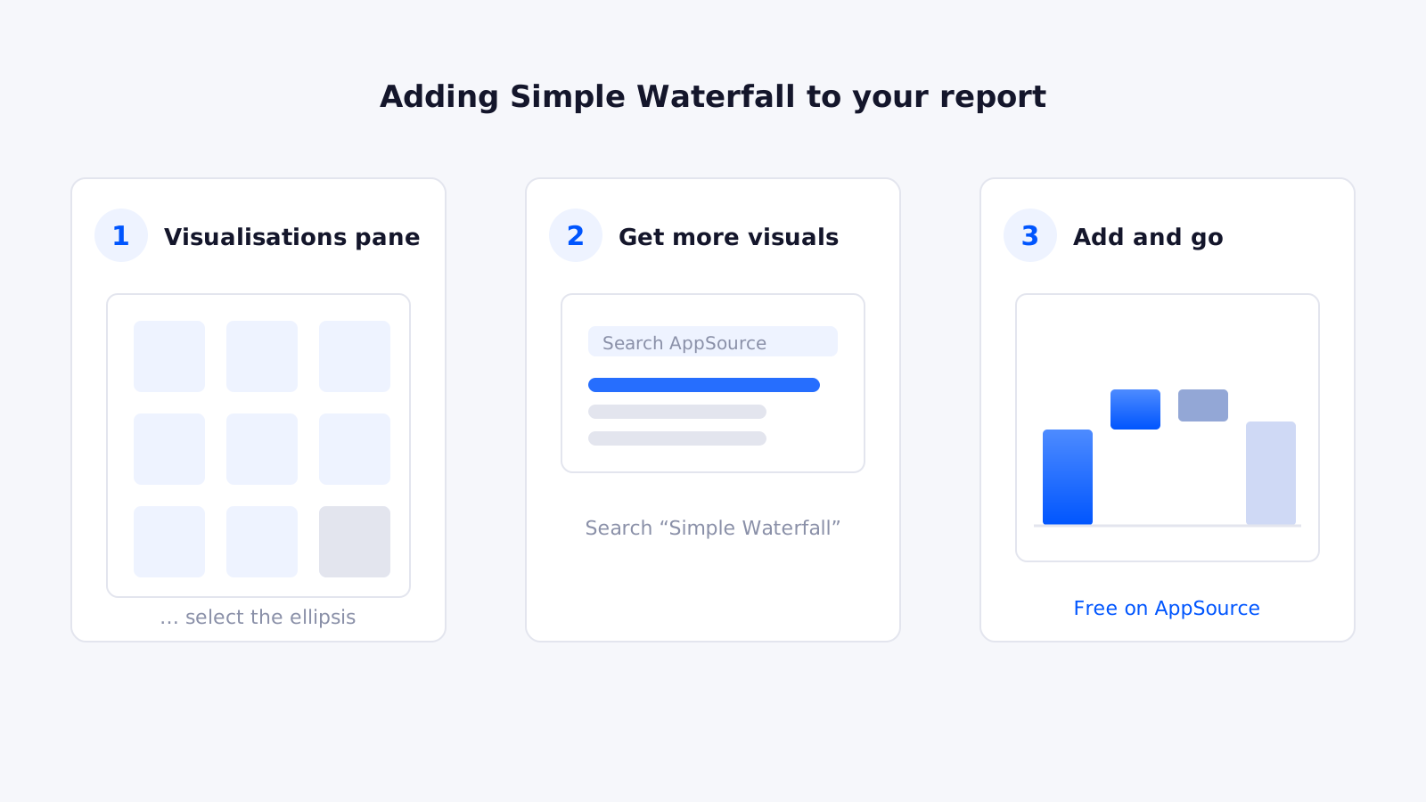
The visual is free and takes two minutes to add. If the harder problem is the model underneath it, that is the part we usually get called about.
30 minutes · no obligation