
Home / Blogs / Data Visualisation Importance in Decision-Making (With Examples)
Data Visualisation Importance in Decision-Making (With Examples)

What if data isn’t another hectic task on your full plate, but a strategic map to your business goals? Endless spreadsheets of numbers are like a locked treasure chest — you know there’s value inside, but without the right key it’s just a heavy box. Data visualisation is that key, turning raw numbers into actionable intelligence so you can spot patterns, trends and opportunities.
Why data visualisation matters for managers
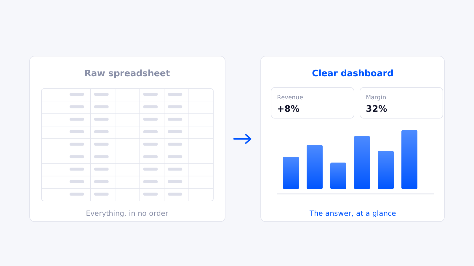
Ask “why did sales drop last month?” and you might get a 20-tab spreadsheet or a 50-slide deck and a few sighs. Raw data isn’t insight. A well-designed dashboard answers the question at a glance.
- Are you on the right route? Identify top performers and bottlenecks at a glance, track KPIs in real time and act before issues accelerate.
- Cut the risk. Reduce gut-based decisions with insights that let you decide quickly and confidently.
- Time is money. A good dashboard instantly reveals what’s working and gives your team hours back.
- Spot trends early. Detect a dip in retention or a shift in demand before it escalates.
- No more “death by PowerPoint.” A simple chart turns confusing data into a compelling story that wins buy-in.
Your biggest enemy isn’t a competitor — it’s the “we’ve always done it this way” mindset. Think of visualisation as your early-warning system: a supply-chain manager spots shipment delays on a live dashboard and reroutes before customers complain.
Data visualisation with Power BI: why it’s a game-changer
Data is only useful if it’s understood. Power BI lets managers build interactive dashboards, connect multiple data sources, automate reports for real-time decisions, customise insights per department, filter dynamically and even predict trends with AI-powered insights. If your company still relies on static monthly reports, you’re missing out. See our top 10 Power BI visuals for where to start.
Best practices for data visualisation
- Numbers need context. “Sales dropped 20%” needs a why — seasonal? supply chain? Without it, people assume the worst.
- Pie charts aren’t for everything. Bar charts for comparisons, line charts for trends, scatter plots for relationships.
- Simple is better. Keep a clean, minimal design so the important insights stand out.
- Keep labels clear. If people have to squint or tilt their head, you’ve lost them.
- Watch out for scale manipulation. A Y-axis starting at 50 instead of 0 can fake “huge” growth — be honest; your credibility depends on it.
- Spotlight what matters. Use colour, bolding or annotations to guide the audience to the right conclusion.
Want to see it in action?
Treat your business data like a royal advisor — are you listening, or making blind decisions and letting opportunities slip away? The right visualisation strategy can be the difference between growth and stagnation. Let’s turn your data into a strategic advantage.
Ready to trust your numbers again?
Book a free 30-minute call and we’ll talk through your current reporting and what’s possible.