
Home / Blogs / 7 Best Power BI Charts for Financial Reporting (and How to Use Them)
7 Best Power BI Charts for Financial Reporting (and How to Use Them)

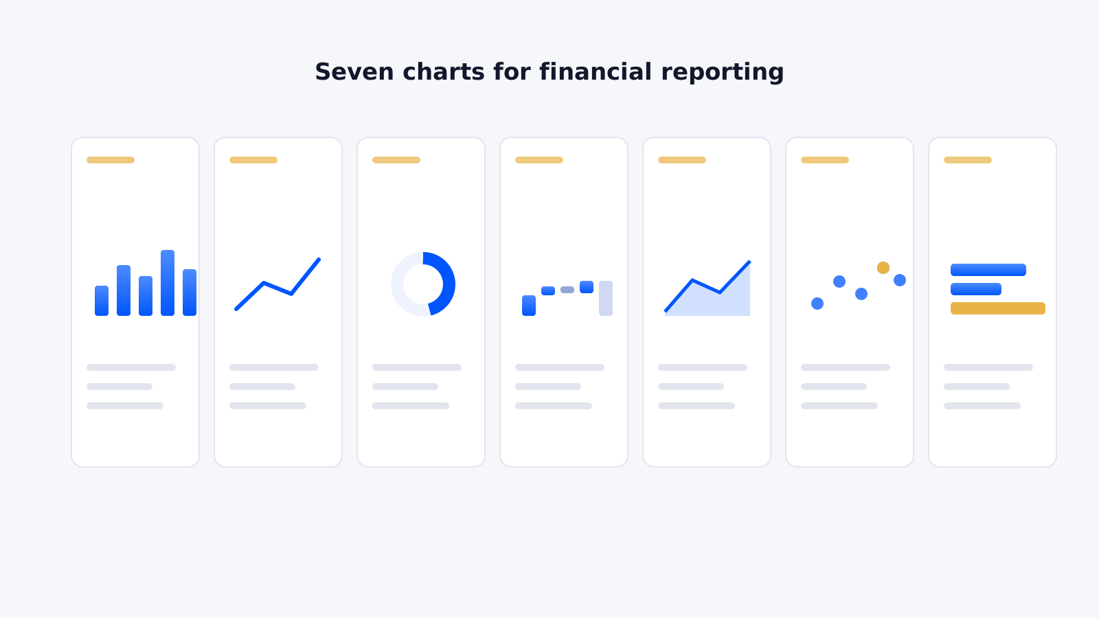
If you’re building a Power BI dashboard for financial reporting and want to make a CFO or FD smile (it’s possible), you’re in the right place. We build finance dashboards for clients across sectors, so here’s our checklist of free visuals that don’t just look good — they make reporting sharper, faster and easier to explain in meetings. The difference-maker is the right visual.
1. Waterfall Chart — the “where did my money go?” chart
Perfect for variance analysis. Shows how you got from point A (budget) to point B (actuals), breaking down the ups and downs so everyone sees what’s moving the needle. When to use: month-end variance reviews, explaining why profit dipped or soared, and board presentations when someone asks “but what changed?”
2. Line & Clustered Column Chart — the “past, present, future” chart
Great for trends and comparisons. Columns show the hard numbers (monthly revenue) while the line adds a related trend (YoY growth %). When to use: forecast vs actual, spotting seasonality, tracking revenue against expenses on one chart.
3. Treemap — the “who’s pulling their weight?” chart
Segment or product breakdowns at a glance. Each block is a category and its size shows contribution. When to use: which product lines carry the business, top regions, or which client pays the office rent.
4. Gauge — the “how healthy are we?” chart
For KPIs that scream dashboard material — a speedometer for profit margin, revenue vs target or cash-flow health. When to use: KPIs that need a good/bad, on-track/off-track read at a glance.
5. Decomposition Tree — the “detective” chart
For root-cause analysis. Drill down by region, product or salesperson until you find the culprit — financial CSI. When to use: explaining revenue/cost variances, identifying why churn rose, answering “can you break that down further?”
6. Matrix Table — “Excel, but make it pretty”
Granular and detailed, with drill-downs, conditional formatting and interactivity — the detail without drowning in rows. When to use: P&L statements, balance-sheet views, regional breakdowns.
7. Area Chart — the “cumulative storytelling” chart
Best for showing how things build up over time; the filled area adds weight to the story. When to use: cumulative revenue trends, operating cash flow, growth stacking up month by month.
Final word
You don’t need every chart under the sun — just the right ones at the right time. With these seven, financial reporting goes from “here’s a spreadsheet” to “here’s the story of our business.” For more, see our top 10 Power BI visuals.
Ready to trust your numbers again?
Book a free 30-minute call and we’ll talk through your current reporting and what’s possible.