If you’re here, chances are you’ve come across Datanomy’s Technologies highly-rated, Power BI ‘Simple Waterfall‘ chart, and with this blog we aim to navigate you through the visual’s basics. In case you hadn’t heard of it, Welcome!
Feel free to quickly skim to the content you’re looking for, here are the topics we cover in the blog:
-
- Overview
- How To Find The Add-In Within Power Bi
- Types of Waterfall Chart (And different ways of creating the chart)
- General Formatting
- Visual Formatting
Overview of Simple Waterfall Visual
The Simple Waterfall Chart in Power BI is a fantastic tool for visualising how an initial value evolves through a series of positive and negative changes. Think of it as a way to show the journey from point A to point B, with each intermediate step clearly broken down. It’s perfect for highlighting differences between data points—those “pillars”—and the steps in between that explain those differences.
What makes this visual so handy is its ability to simplify complex data into something easy to follow. It categorises your data into pillars (starting or ending points) and steps (incremental changes), so you can see exactly how the pieces add up—or subtract down. Most importantly, it’s customisable! You can decide which data should act as pillars or steps, tweak colours to reflect positive or negative changes, sort the data for better clarity, and adjust labels and axes to fit your reporting style.
Meet the team behind Simple Waterfall Chart here!
Overall, the Simple Waterfall Visual is all about making data-driven storytelling effortless. Whether you’re tracking financial performance, analysing trends, or breaking down contributions to a total, this visual makes it crystal clear how everything fits together.
Watch a quick video: Simple Waterfall – version 1.0 (youtube.com)
How To Find The Add-In Within Power Bi
Once you’ve opened your report in the Power BI application of your choice, follow the guide below. You can also find the instructions in the Instructions guide.
Step 1: Select the ellipsis from the visualisations pane
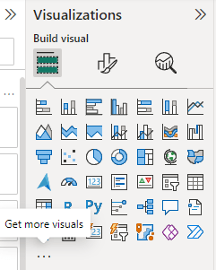
Step 2: When adding the Simple Waterfall Custom Visual to Power BI, there are two options available.
The first option is ‘Get More Visuals’.
- If you want the most up-to-date version, with the latest features and improvements, this is the recommended choice.
- Clicking on ‘Get More Visuals’ opens AppSource, Power BI’s built-in marketplace, where you can search for ‘Simple Waterfall’ and install it directly.
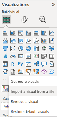
The second option is ‘Import from File’.
- This is useful if you have a specific version of the visual in a .pbiviz file, downloaded earlier.
- You can manually import it into Power BI without relying on AppSource.
- For importing from file, select “Import a custom visual” from the menu.
- Select the custom visual file in the folder you downloaded it to, then select Open.
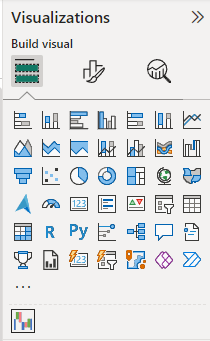
Step 3: The visual will appear as a new icon in the visualisations pane. Select it to create the visual on the report canvas.
For more details, refer to Import Power BI visuals from AppSource or from a file – Power BI | Microsoft Learn
Types of Waterfall Charts
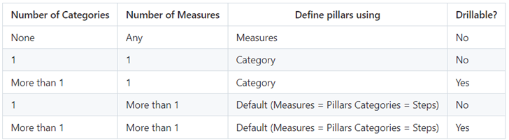
I. Static Measures:
-
- Uses only measures.
- No category field is used.
- Pillars/steps are manually defined by the user based on measures.
II. Static Category:
-
- Uses category and 1 measure.
- Pillars/steps are manually defined by the user based on the category.
Involves having one field in the category section and measure in the values section.
III. Drillable Category:
-
- Utilises 2-3 fields in the category section and measure in the values section.
- Supports drill-down capability.
IV. Drillable Measures:
-
- Calculates the difference between each column and use this as a step
- Uses the total of columns as pillars. There can be 2-3 measures as pillars.
- Supports drill-down capability with multiple fields in the category
- Default (Measures = Pillars and Categories = Steps)
Different ways of creating charts-
General Formatting
I. Properties
-
- Size (Height, Width): Specifies the dimensions of the chart.
- Position (Horizontal, Vertical): Controls the placement of the chart within the Power BI canvas.
- Padding: Adjusts the spacing between the edges of the chart and surrounding elements.
II. Title Options
- Text: Sets the title text displayed above the chart.
- Heading: Defines the heading level (e.g., H1, H2) for the title.
- Font: Specifies the typeface or font style used for the title text.
- Text Colour: Defines the colour of the title text.
- Background Colour: Sets the background colour behind the title text.
- Horizontal Alignment: Aligns the title text horizontally within its container.
- Text Wrap: Determines whether the title text wraps within its allocated space.
Inside Title:
1. Subtitle: Inherits the same formatting options as the main title.
2. Divider:
-
- Colour: Specifies the colour of the divider line.
- Line Style: Defines the style of the divider line (e.g., solid, dashed).
- Width: Sets the thickness or width of the divider line.
- Ignore Padding: Controls whether padding affects the placement of the divider.
3. Spacing Options:
-
- Space Between Label and Value: Adjusts the spacing between labels and their corresponding values.
- Customise Spacing: Provides flexibility to customize additional spacing options as needed.
III. Effects
-
- Background Options: Configures the background appearance of the chart.
- Visual Border: Adds a border around the chart for emphasis or delineation.
- Shadow: Applies a shadow effect to the chart to create depth or visual separation.
IV. Header Icons
Colour Options:
- Border Colour: Defines the colour of the border around header icons.
- Background Colour: Specifies the background colour of header icons.
- Icon Colour: Sets the colour of the icons themselves.
- Transparency: Adjusts the opacity of the header icons.
Icon Options: Enables or disables the display of icons within the chart header.
V. Tooltip Options
Configures the appearance and behaviour of tooltips that appear when users hover over data points or elements within the chart.
Visual Formatting
I. Chart Options
1. Chart Orientation
-
- Vertical: Represents data vertically, suitable for visualising sequential data points or categories in a waterfall format from top to bottom.
- Horizontal: Displays data horizontally, useful for comparing data across categories or time periods along a horizontal axis.
2. Format Using Sentiments
-
- Favourable (Green), Adverse (Red), Total (Blue), Other: Allows users to define colour formatting based on sentiment analysis of data points within the waterfall chart.
- Custom Colour Definition: Users can also individually assign colours to each pillar or step based on specific meanings or preferences.
3. Sort Data
-
- Default: Displays data as per the default sorting defined in the underlying data model.
- Ascending: Orders data points or categories in ascending order based on a chosen metric or attribute.
- Descending: Orders data points or categories in descending order, useful for viewing data from highest to lowest or vice versa.
II. Define Pillars
The “Define Pillars” feature in the Simple Waterfall Chart allows users to designate specific measures as pillars or steps within the visualisation. Each measure can be individually toggled on or off to control its role as either a pillar or a step.
-
- Users can switch on (enable) or off (disable) the toggle in front of each measure.
- When switched on, the measure is designated as a pillar in the chart, indicating a starting or ending point of value.
- When switched off, the measure is considered a step, representing intermediate changes or adjustments between pillars.
III. Margins
-
- Top Margin: Adjusts the space between the top edge of the chart and the nearest element or border.
- Bottom Margin: Controls the space between the bottom edge of the chart and the nearest element or border.
- Left Margin: Specifies the distance between the left edge of the chart and the nearest element or border.
- Right Margin: Manages the space between the right edge of the chart and the nearest element or border.
IV. Bar Colour
The Bar Colour feature in the Simple Waterfall Chart determines how each bar (pillar or step) is coloured based on the underlying data and user preferences. Also, it is directly influenced by the “Sentiments” option toggle.
1. Sentiments Option On
-
- Total: Represents the aggregate value across all data points in a distinct colour (e.g., blue).
- Favourable: Colours bars in green to signify positive impacts or changes.
- Adverse: Colours bars in red to indicate negative impacts or changes.
- Other: Provides a customizable colour option for bars not falling under the above categories.
2. Sentiments Option Off: Users can individually define colours for each pillar and step based on specific data interpretations or visual preferences.
V. Legend Options
The Legend Options feature in the Simple Waterfall Chart controls the display and customisation of the legend within the visualisation. Its availability and options depend on whether the “Sentiments” option is turned on or off.
1. Options in Legend
-
- Sentiment – Favourable: Displays a legend item for favourable sentiment data points.
- Sentiment – Adverse: Shows a legend item for adverse sentiment data points.
- Font Size: Adjusts the size of the text within the legend items.
- Font Colour: Specifies the colour of the text used in the legend.
- Font Family: Defines the typeface or font style used for the legend text.
2. Interdependence with Sentiments Option
-
- Sentiments On: The legend includes items for categorising data by favourable, adverse sentiments, providing contextual information about colour coding.
- Sentiments Off: The legend options related to sentiments disappear, reflecting user-defined colours for individual pillars and steps without sentiment categorisation.
VI. X-Axis Options
- Font Size: Specifies the size of the font used for the labels on the X axis.
- Font Colour: Defines the colour of the font used for the labels on the X axis.
- Font Family: Sets the typeface or font style for the labels on the X axis.
- Fit to Width: When enabled, adjusts the width of the chart to ensure all labels on the X axis are fully visible within the available space.
- Minimum Bar Width: Appears when “Fit to Width” is disabled. Allows users to set the minimum width of the bars on the chart, ensuring they remain distinguishable even when labels are long or numerous.
- Wrap Text: Determines whether text labels on the X axis should wrap to the next line if they exceed the available width.
- Padding: Controls the spacing between the labels and the edges of the chart area on the X axis.
- Show/Hide Gridlines: Toggles the visibility of gridlines along the X axis.
-
-
- Stroke Width: Appears when gridlines are shown. Defines the thickness or width of the gridlines.
-
- Gridlines Colour: Appears when gridlines are shown. Specifies the colour of the gridlines.
VII. Y-Axis Options
1. Base Starting Point (Auto/Zero)
-
- Determines the starting point of the Y axis.
- Auto: Automatically adjusts the starting point based on the data range.
- Zero: Sets the starting point of the Y axis at zero, ensuring all values are relative to this baseline.
2. Show/Hide Values
-
- When enabled, displays numerical values or measures next to each bar in the chart.
- Font Size: Sets the size of the font used for displaying values.
- Font Colour: Defines the colour of the font used for displaying values.
- Value Format (Auto/Thousands/Millions/Billions):
-
-
- Specifies how numerical values should be formatted for clarity and readability.
- Value Decimal Places:
-
-
- Controls the number of decimal places displayed for numerical values.
3. Show/Hide Gridlines
-
- Toggles the visibility of gridlines along the Y axis.
- Stroke Width: Defines the thickness or width of the gridlines.
- Gridlines Colour: Specifies the colour of the gridlines.
4. Show Zero Line
- When enabled, displays a horizontal line at zero on the Y axis.
- Zero Line Width: Defines the thickness or width of the zero line.
- Zero Line Colour: Specifies the colour of the zero line.
5. Join Bars
- When enabled, connects adjacent bars in the waterfall chart with a line.
- Join Bar Stroke Width: Defines the thickness or width of the line connecting the bars.
- Join Bar Colour: Specifies the colour of the line connecting the bars.
VIII. Labels Options
- Font Size: Specifies the size of the font used for displaying labels.
- Use Default Font Colour for Labels: When enabled, applies a default colour to all labels in the chart. Users can choose a preferred colour for all labels.
- When disabled (off): Users can individually set colours for different types of labels
-
-
- Total: Colour for total value labels.
-
- Favourable: Colour for labels indicating favourable sentiment.
-
- Adverse: Colour for labels indicating adverse sentiment.
-
- Other: Colour for labels not categorised under the above types.
-
- Font Family: Sets the typeface or font style used for displaying labels.
-
- Use Default Label Positioning: When enabled, applies a default positioning for all labels.
-
- When disabled (off): Users can individually adjust positioning for each type of label.
-
- Value Format: Specifies how numerical values associated with labels should be formatted (auto, thousands, millions, billions, etc.).
-
- Hide Zero/Blank Values: Toggles the visibility of labels for data points that have zero or blank values.
-
- Value Decimal Places: Controls the number of decimal places displayed for numerical values in labels.
Once you set Value Format to Auto, it works as expected (M,bn etc.) and you can control decimal places in the labels. If you set Value Format to None, the label formatting depends on the measure’s format, and the decimal places option in the formatting pane won’t apply.
Conclusion
To wrap things up, the Simple Waterfall Chart is a must-have visual in Power BI if you’re looking to break down data and highlight how values change step by step. Whether you’re analysing financial trends, tracking performance, or just trying to make sense of complex data, it’s a versatile tool that delivers clarity and impact.
In addition, click here to learn about Simple Waterfall Visual’s functionalities, in the older and newer versions.
From understanding its purpose and locating the add-in, to mastering formatting options, you now have everything you need to make the most of this visual. The key is to experiment with the formatting and customisation features to tailor it to your specific needs.
Here is a temporary work-around for any bugs you might be facing.
We’re always looking to improve the visual, feel free to reach out to us for bugs, feedback or any issues.
So, why not give it a go? Dive into Power BI, create your own Simple Waterfall Chart, and see how it can transform your data storytelling!