New to Power BI?
Here’s what you can do with the demo:
- Choose What You Want to See: Use filters like Year, Profit & Loss Category, Geography, and Scale to view the data that matters to you.
- Go Deeper into the Data: In tables like Profit & Loss, click the ( ↓ ↓ ) icon to see more details, or use the ‘Expand All’ icon to view all levels in the hierarchy. You can also use the + / − signs to open or close rows.
- Click to Filter: Click on any bar, number, or month in a chart, and the whole page will update based on your selection.
- Pick What to Compare: On Page 3, you can choose what numbers to see — like Opening Balance, Closing Balance, or Movement — and the data will update right away.
- Everything Reacts Instantly: Every click or selection changes the visuals immediately, so it’s easy to explore and understand the data.
Excel View
You can access the PDF view of the Excel here!
Outcomes That Drive Decisions
Each visual element in the dashboard serves a real decision-making purpose:
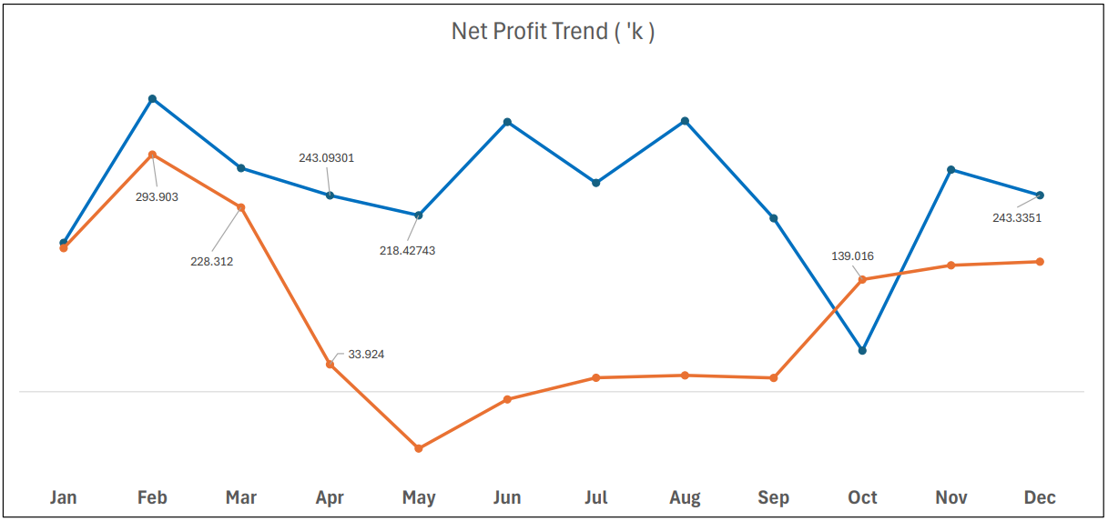
- Month-on-Month Trends
Quickly identify revenue dips, cost spikes, or margin compression. Teams no longer wait for end-of-quarter surprises, they course-correct in real time. - Variance Waterfall Chart
Breaks down fluctuations into components: revenue changes, COGS impact, operational shifts. It’s a storytelling tool for finance instantly showing what moved, and whether it was good or bad news. - Balance Sheet Interactivity
Toggle between months or divisions to isolate problem areas like sudden drops in receivables or liabilities creeping up. Red flags don’t stay hidden anymore. - Liquidity Ratios
Decision-makers get a living snapshot of short-term financial strength — useful for credit decisions, vendor negotiations, or investor updates.
These aren’t just dashboards. They’re conversation starters for your finance team.
Functionality
Plus, the solution keeps all the amazing functionality that comes with Power BI:
- Subscription
- Seamless Teams collaboration
- Controlled access and role-based security
- Scalable sharing within the organisation
All while ensuring there’s one version of truth, the Power BI semantic model remains the single source driving all views, keeping your numbers consistent, accurate, and trusted.
Excel Integration
The finance team continues to work in Excel as usual. As soon as data is updated and refreshed, the Power BI visuals reflect it instantly.
This means no workflow disruption… just smoother, smarter reporting.
The Result
- Zero manual number-crunching
- Storytelling-ready dashboards + print-ready financials
- Fully tailored to client preferences
- Scalable and sustainable
And most importantly, the finance team finally stopped choosing between form and function, because they got both.
We understand financial logic as well as data logic. That’s why our dashboards don’t just look smart, they think like your finance team does!
So, with Datanomy, you don’t have to choose.
You get a solution that adapts to how you work.
Talk to an expert to see how we can build this for you!