Ever stared at a report and thought, “What is this actually telling me? ”If you’re a Category Manager in retail or FMCG, you’re juggling sales data, promotions, returns, margins, and more. Making sense of it all? That’s the real challenge.
Now imagine this: sales are down 9% this month. A cause for concern? Possibly. But the better question is- what caused the drop?
A line chart might show the trend.
A bar chart might break it down by region or category.
But neither truly explains the “why.”
That’s where the Waterfall Chart comes in. It is the translator, turning complex figures into an easy-to-follow story that explains exactly what’s happening in your category.
What Is a Waterfall Chart?
It’s data storytelling in action.
A Waterfall Chart doesn’t just show the beginning and the end, it captures every step in between. The promotions that ate into margins. The new launch that did well (but not well enough). The de-listed SKUs that quietly chipped away at volume.
Each component is visualised as a step (positive or negative), giving you a precise view of what drove the final outcome.
Why It Matters for Category Managers
Because when performance drops, guesswork isn’t a strategy.
Saying “We suspect it was the discounting…” won’t cut it in a boardroom discussion about shrinking margins. You need to show exactly which levers moved and how much they contributed.
The Waterfall Chart gives you that clarity. It’s not just visually effective, it’s practically invaluable.
Read more on Importance of Data Visualisation here!
Is There Already a Waterfall Chart in Power BI?
Yes. And it’s decent for basic use.
But at Datanomy Technologies, we work with retail teams facing real-world data complexity. And the default option often falls short when deeper analysis is needed.
Have a look at the chart here!
That’s why we built the Enhanced Waterfall Chart. It offers:
- Dynamic Grouping
Instantly switch between brand, sub-category, or geography — no need to rebuild visuals. - Interactive Drill-Downs
Click into a data point to reveal store-level or SKU-level impact. Stay in the flow while zooming in. - Smart Tooltips
See absolute values, percentages, and plan variance at a glance — no guesswork required. - Custom Styling
Reflect your brand’s identity, spotlight anomalies, or mark thresholds clearly. - Performance-Optimised
Built to handle large datasets without delays or crashes.
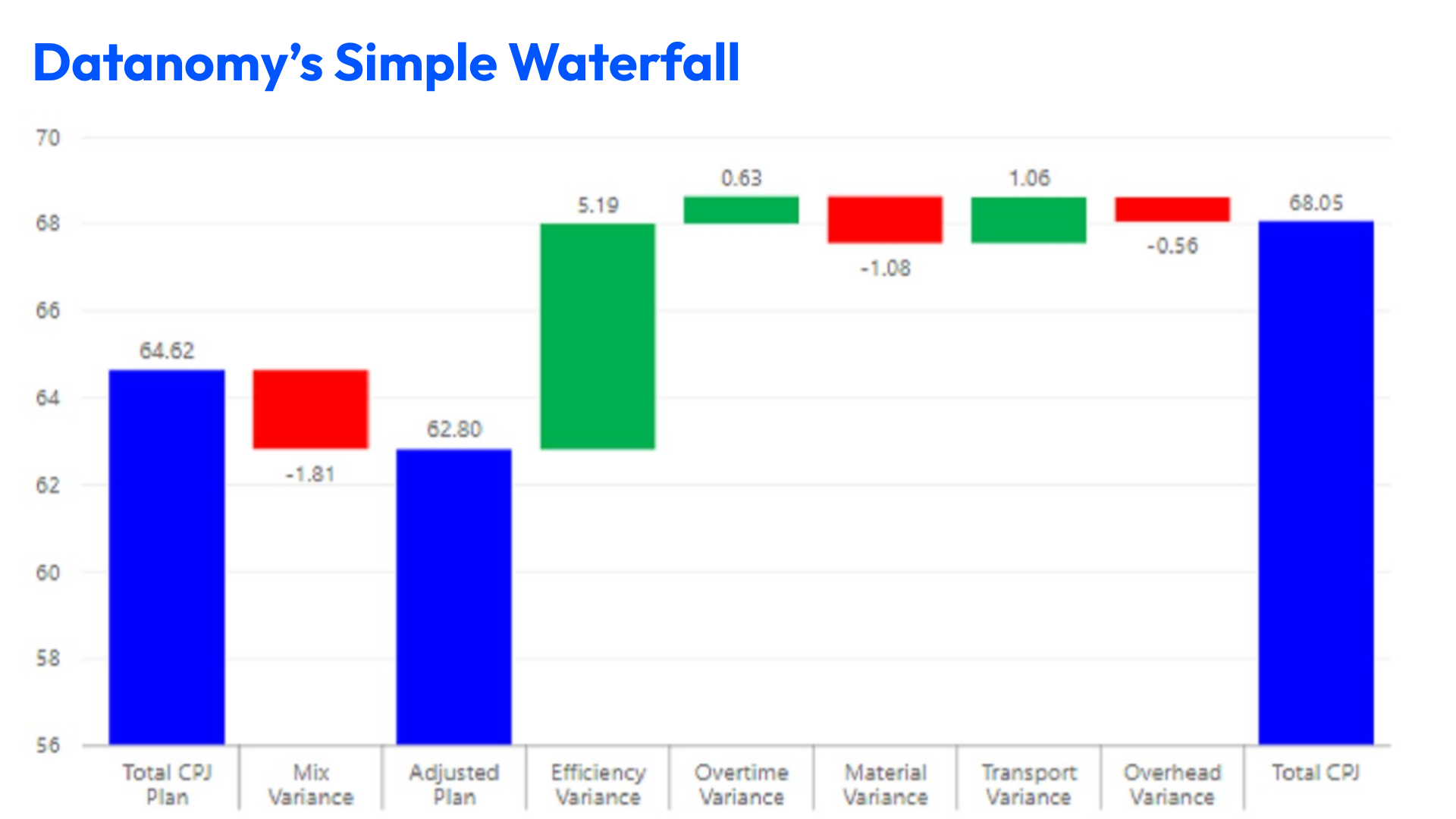
All you need to know about Simple Waterfall Chart!
Real-World Use Cases
- Root-Cause Analysis
When weekly sales drop, pinpoint whether it’s due to lower footfall, stockouts, or pricing issues. - Promotional Effectiveness
Measure how much a ‘Buy One Get One Free’ campaign impacted unit sales and margins. - Assortment Rationalisation
Identify which discontinued products reduced revenue and which had no meaningful effect. - Forecast Variance Explanation
When actuals deviate from plan, provide a step-by-step breakdown to explain why.
What it can do for you?
- Increased Stakeholder Confidence: Back up decisions with clear, visual evidence.
- Faster, More Accurate Reporting: Reduce time spent analysing trends manually.
- Better Margin Control: Spot where profitability is leaking and take corrective action sooner.

How Waterfall Charts Can Improve Team Collaboration
One of the coolest things about Waterfall Charts? They get everyone singing from the same data hymn sheet.
Here’s how they make teamwork smoother:
- No more guesswork
When everyone sees the same clear story, there’s less “I think this” or “maybe that.” Just straight-up facts. - Speedy decisions
Clear insights mean teams can agree on next steps without wasting time in endless debates. - Who’s responsible?
The chart highlights what’s helping or hurting results, so everyone knows where to step up or step back. - Win hearts and minds
Presenting your data with Waterfall Charts makes reports more engaging, so stakeholders actually want to listen. - Build a data culture
The more teams see these clear visuals, the more they start trusting data over gut feeling. That’s a win for everyone.
Integrating Waterfall Charts into a Broader Power BI Dashboard
Like a good wine, Waterfall chart shines bright, but shines even brighter when paired well. Here’s how to make it a part of a winning team with the rest of your dashboard to give the best outcome:
- Heatmaps first: Spot the hotspots with a heatmap, those regions or stores firing on all cylinders, and then zoom in with your Waterfall Chart to see why.
- KPIs on hand: Place key numbers like total sales or margins close by. They give quick context and make your chart’s story more impactful.
- Trend lines tell the bigger story: While Waterfalls break down step-by-step changes, trend lines show the overall flow (like the season’s highs and lows).
- Click and explore: Interactive drill-downs let you dive straight into the nitty-gritty, store-level or SKU details, without breaking your flow.
- Keep it neat: Match your chart’s style to the rest of your dashboard. A consistent look keeps things professional and easy on the eyes.
Summing up: Waterfall Charts Are Essential, Not Optional
In today’s fast-paced retail environment, Category Managers are expected to turn complex data into strategic decisions. Fast.
The Waterfall Chart gives you the clarity and confidence to do just that.
So, the next time you’re faced with a performance shift, ask:
“Do I really know what caused this?”
Then pull up the Waterfall Chart and let the data tell its story.
The Datanomy Team can help Category Managers unlock the full potential of Power BI from advanced visuals like our Enhanced Waterfall Chart to fully customised dashboards that drive action, not just admiration.
Want to see what our chart could reveal about your category?