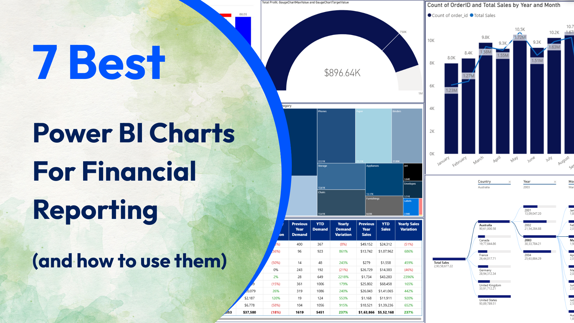
7 Best Power BI Charts For Financial Reporting (and how to use them)
Datanomy’s highly-rated, Power BI ‘Simple Waterfall‘ chart is a fantastic tool for visualising how an initial value evolves through a series of positive and negative changes.
Read More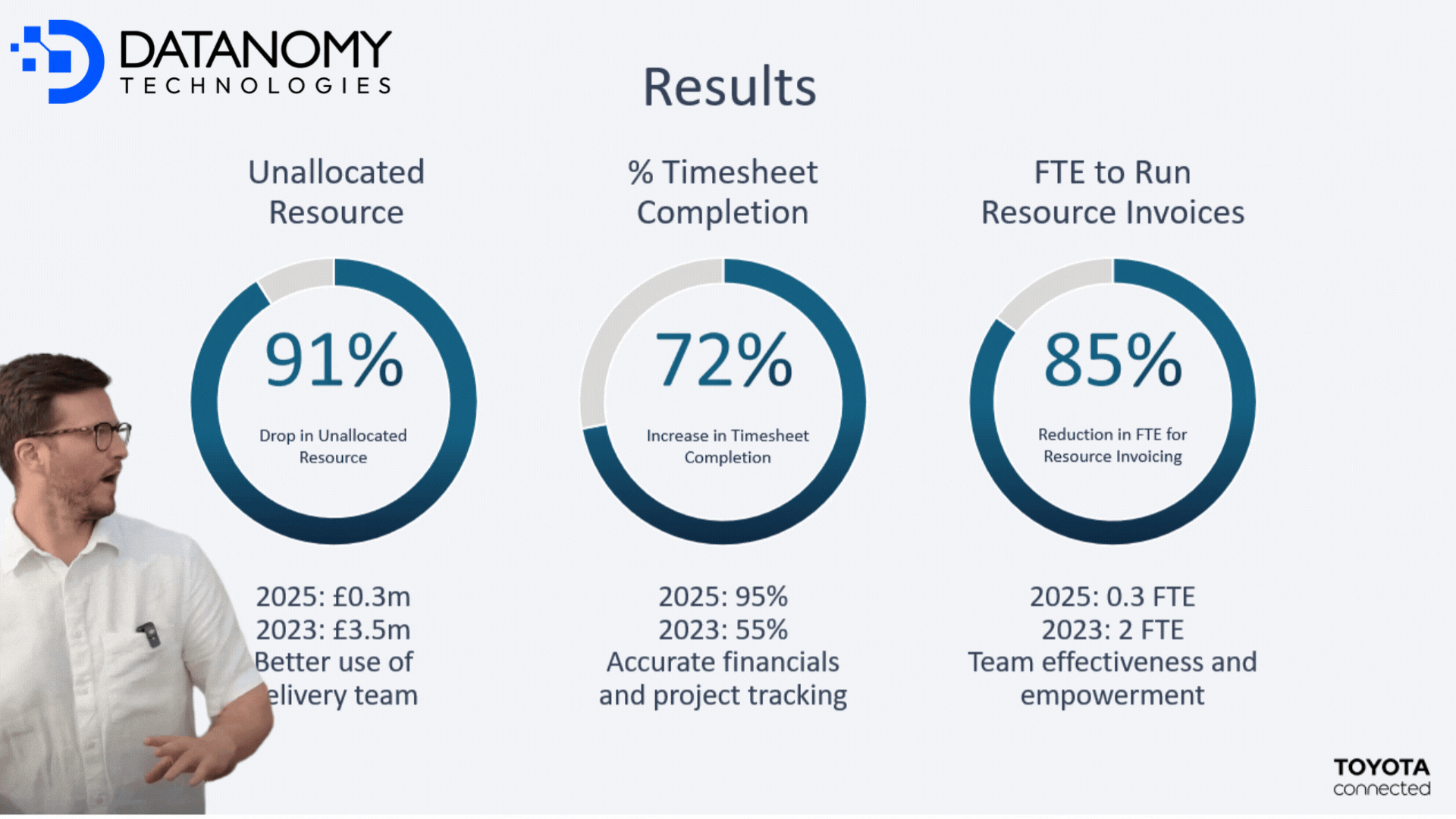
Toyota Connected Case Study
Read how Datanomy combined drill-downs, variance analysis & trend storytelling with boardroom-ready aesthetics for financial reporting for one of our clients!
Read More
How Category Managers Use Waterfall Chart For Smarter Decisions
Datanomy’s highly-rated, Power BI ‘Simple Waterfall‘ chart is a fantastic tool for visualising how an initial value evolves through a series of positive and negative changes.
Read More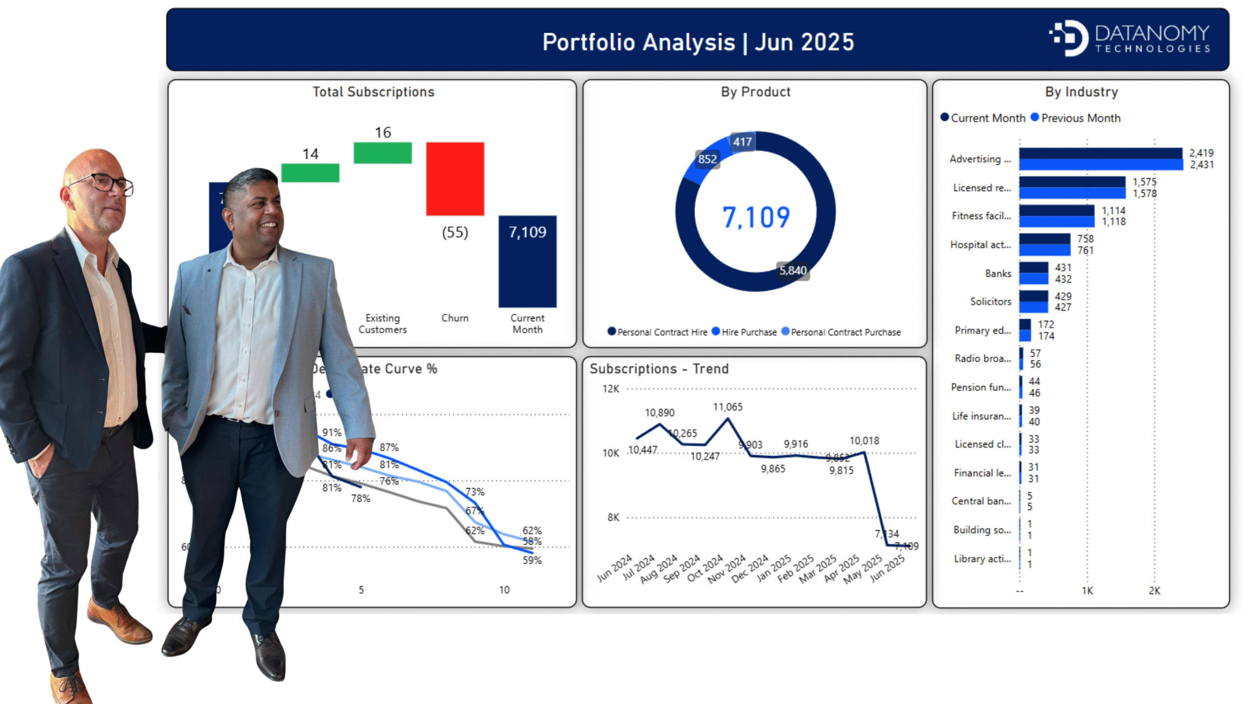
The Portfolio Analyser
Read how Datanomy combined drill-downs, variance analysis & trend storytelling with boardroom-ready aesthetics for financial reporting for one of our clients!
Read More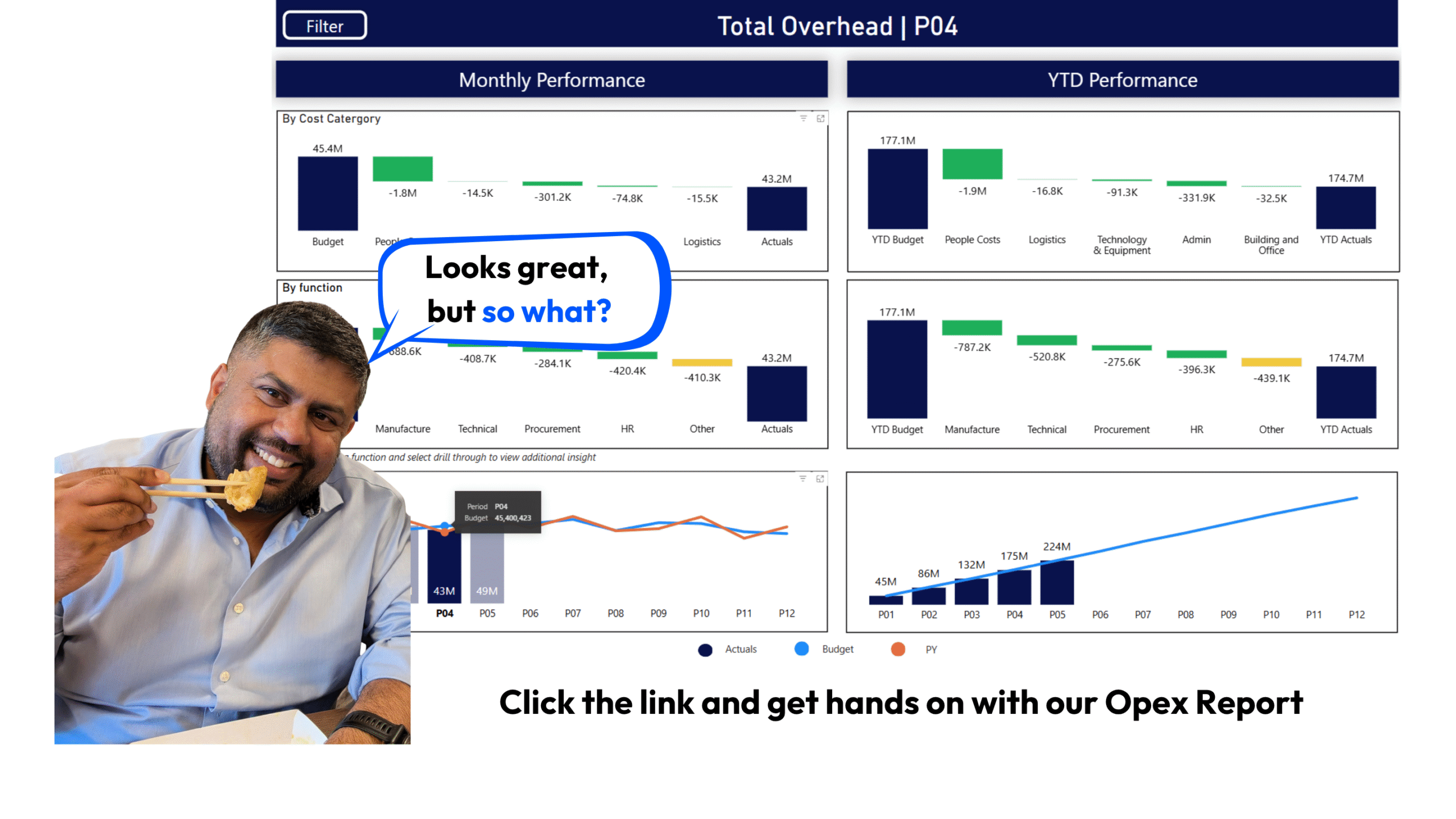
What’s going on with my Overheads?
Read how Datanomy combined drill-downs, variance analysis & trend storytelling with boardroom-ready aesthetics for financial reporting for one of our clients!
Read MoreFinancial Reporting: Would You Prefer Practical or Aesthetic
Read how Datanomy combined drill-downs, variance analysis & trend storytelling with boardroom-ready aesthetics for financial reporting for one of our clients!
Read More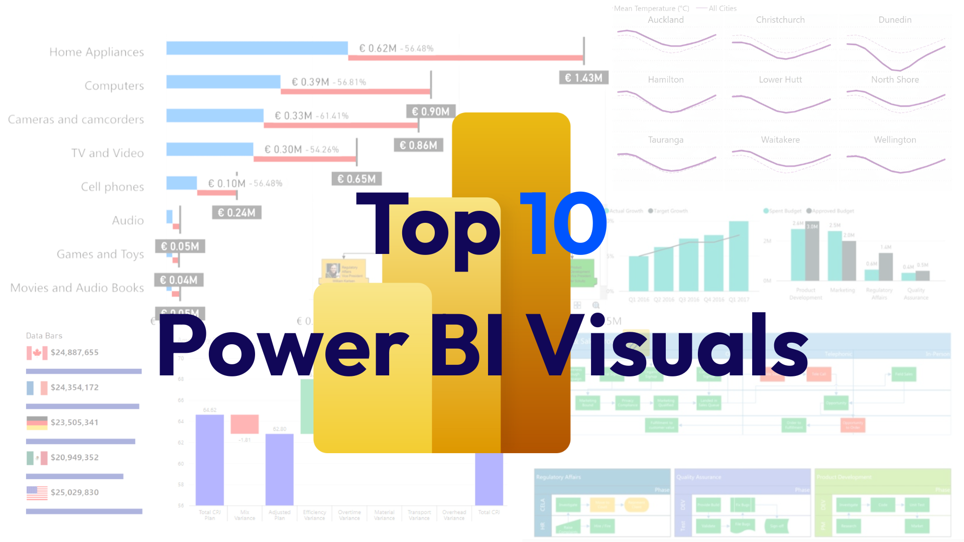
Top 10 Power BI Visuals (2025’s best) With Use Cases & Pro Tips
Datanomy’s highly-rated, Power BI ‘Simple Waterfall‘ chart is a fantastic tool for visualising how an initial value evolves through a series of positive and negative changes.
Read More
Data Visualisation Importance in Decision-Making (With Examples)
Datanomy’s highly-rated, Power BI ‘Simple Waterfall‘ chart is a fantastic tool for visualising how an initial value evolves through a series of positive and negative changes.
Read More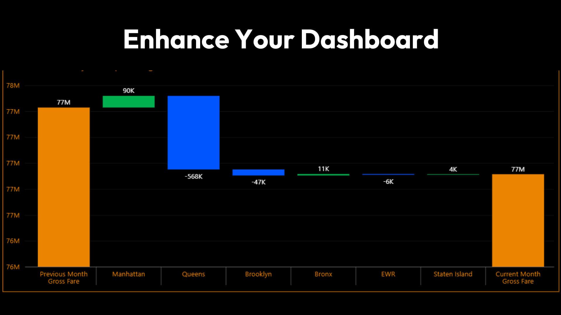
Simple Waterfall PBI Visual- All you need to know
Datanomy’s highly-rated, Power BI ‘Simple Waterfall‘ chart is a fantastic tool for visualising how an initial value evolves through a series of positive and negative changes.
Read More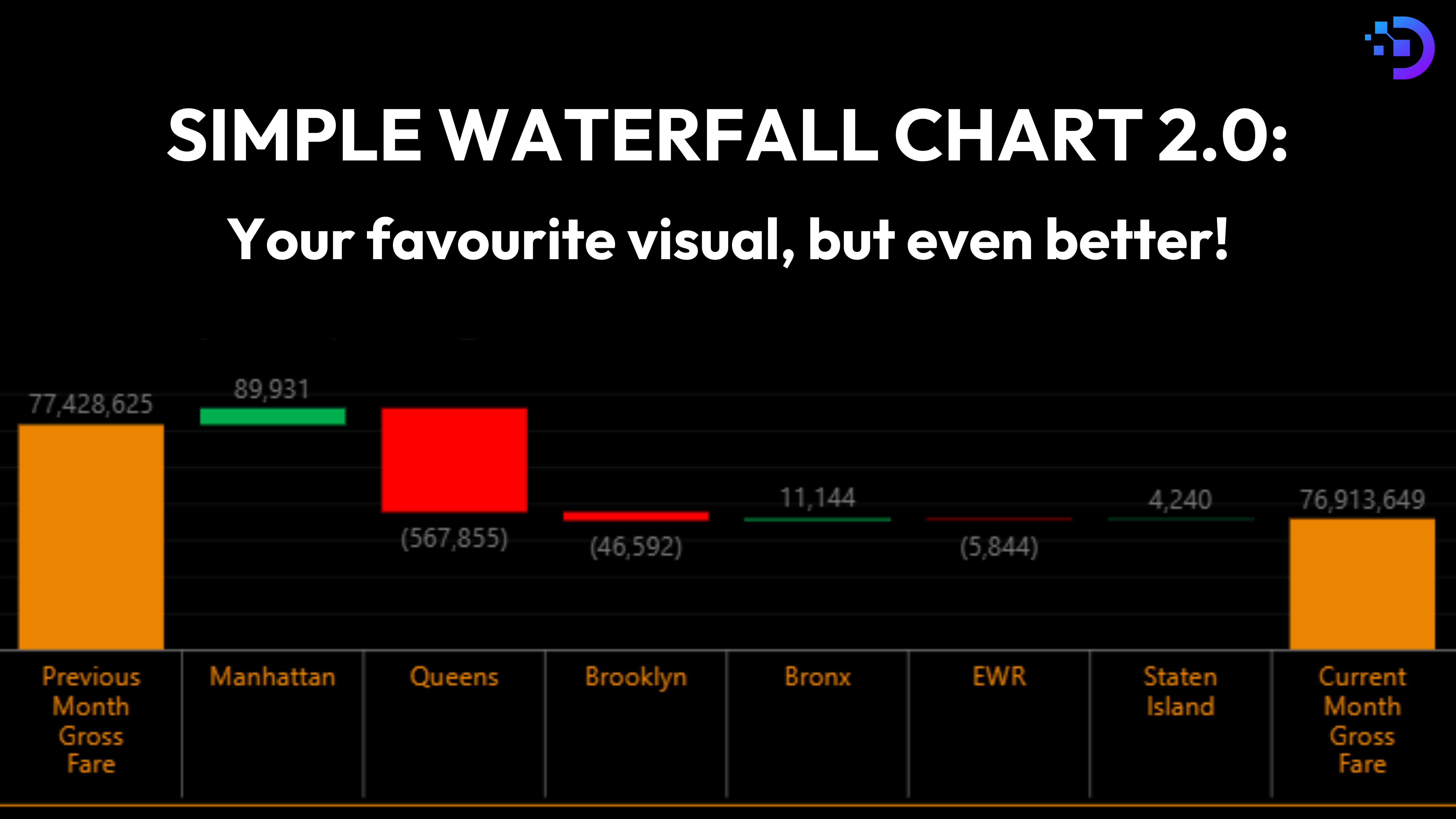
Simple Waterfall Chart: New version & Bug Fixes
There’s always a Power BI visual that is permanent in your dashboards, and finding a bug in this visual can really derail your reports, but if that visual is Simple Waterfall chart by Datanomy Technologies, you’re in luck! In this blog, we’re diving into a temporary workarounds for the bugs you might be facing, […]
Read More