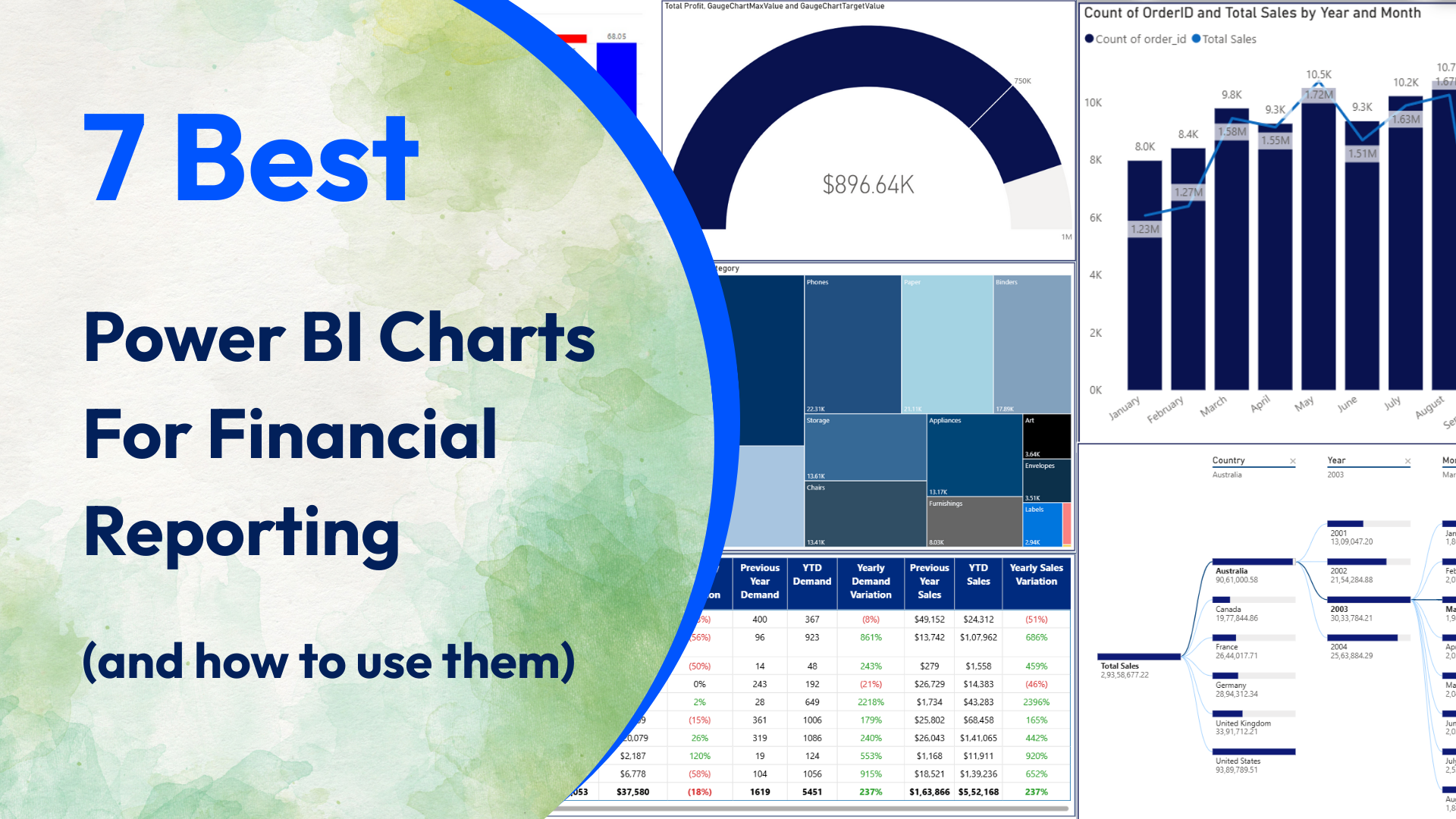
7 Best Power BI Charts For Financial Reporting (and how to use them)
Datanomy’s highly-rated, Power BI ‘Simple Waterfall‘ chart is a fantastic tool for visualising how an initial value evolves through a series of positive and negative changes.
Read More
